Drop a PDF here or click to upload
Get a PDF's fonts, sizes and colors as CSS
Or drop files anywhere on this page. Files are processed in your browser and never uploaded.
Get a stylesheet from any PDF that has real text: the fonts, text sizes, colors, line height, heading styles, page size and margins, written as CSS variables and classes you can paste into a website.
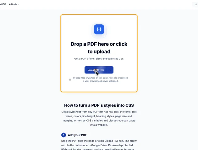
Drag the PDF onto the page or click Upload PDF file. The arrow next to the button opens Google Drive. Password-protected PDFs ask for the password and are unlocked in your browser.
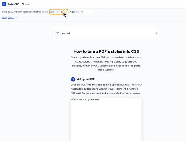
Choose px, rem or pt for the sizes. Leave Pages empty to read the whole document, or type a range such as 1-5 if only part of it has the design you want. Under More options you can leave out the text style classes, the color palette or the page size.
Click Get CSS. The colors appear as swatches, each text style is shown in its own font, size and color, and the full stylesheet appears below with a Copy button.
Click Continue to download to save the stylesheet as a .css file, or copy it straight into your project.

The converter reads every piece of text in the PDF together with its font, size, weight, slant and color, and the colors of the filled boxes and bars on the pages. It then writes what it found as a stylesheet in three parts.
The :root block holds CSS variables you can reuse anywhere. The fonts come first, most used first, so --font-body is the font with the most text in the document. Each font name is the one used in the PDF, followed by common fallbacks, because many PDF fonts are commercial fonts that won't be installed on every computer. If the font matters for your site, add it with @font-face or a font service.
Next come the body text size and line height. The size is the one with the most characters. The line height is measured from the distance between the lines of normal paragraphs, divided by the text size, so it carries over to any size you use.
The color palette lists the text colors, most used first, and the fill colors of boxes, bars and table shading, largest area first. White fills are left out because they're usually just the page.
The body rule uses those variables. Headings are found the same way as in the PDF to Word converter, by comparing the size and weight of short lines with the body text, and h1 to h3 get the style used most often at each level.
The .page rule describes a box the size of the PDF page with the page's margins as padding, measured from where the text starts and ends. That's handy for print stylesheets or for a web version of a document that should keep the same proportions.
Every combination of font, size, weight, slant and color becomes a class, such as .text-style-1, numbered from the most used. A comment next to each class says how many characters use it and shows a short example of the text, so you can tell at a glance which one is the body text, which is a caption and which is a heading. Colors and fonts in the classes point to the variables where they can, so changing a variable updates everything that uses it.
px matches the PDF's sizes on screen: one PDF point is 1.333 pixels. rem divides those pixels by 16, the usual browser default, so the sizes scale with the reader's font settings. pt keeps the PDF's own numbers and suits print stylesheets.
Scanned PDFs have no text to read, so run OCR PDF first. The PDF is read in your browser and isn't uploaded, and the tool also works offline once the page has loaded.
No. It writes the font names used in the PDF, each with common fallbacks. Many PDF fonts are licensed and only partly embedded, so add the fonts to your site yourself if you need the exact ones.
px matches the sizes on screen (1 PDF point is 1.333 px), rem scales with the reader's font settings, and pt keeps the PDF's own numbers for print stylesheets.
Your file stays on your device. It is read in the browser and never uploaded, so it isn't stored on a server.
The PDF is probably a scan, which is a picture of text. Run OCR PDF first, then get the CSS from the result.
